

What You’ll Learn 🧩
Understand the C++ Widget Plugin framework and how custom widgets integrate with DewesoftX’s interface
Set up the development environment: install Visual Studio, DewesoftX widget plugin template (VSIX), and configure DEWESOFT_EXE path
Create your first widget plugin using the wizard: configure project metadata, base class, and example template
Build example widgets like a digital meter: implement drawCanvasData, define visuals, and test live data display
Develop advanced widget rendering: use VisualProperties, handle updateVisualProperties, visualPropertyChanged, and button events
Import and export .vc plugin bundles for easy deployment across DewesoftX installations
Structure projects with test support: use separate test projects and unit tests (gtest) for widget logic validation
Transition from sample templates to fully custom visuals: modify and extend templates, remove sample code, and iterate on unique widget behavior
Course overview
The Custom Display Widget Plugins course empowers developers to extend DewesoftX’s visualization capabilities with fully custom, C++-based interface components. It starts by introducing the C++ Widget Plugin framework, which abstracts DewesoftX internals accessed via DCOM and enables seamless integration of new visual instruments.
You’ll then walk through setting up your development environment: installing Visual Studio, the DewesoftX widget plugin template (via VSIX), and configuring environment variables (DEWESOFT_EXE_X64 or X86) so your new widget can be automatically detected by DewesoftX.
Next, the course guides you in creating and customizing your first plugin. Using the Visual Studio wizard, you’ll generate boilerplate code and metadata before building a simple digital meter that renders channel values in real-time using drawCanvasData. Along the way, you’ll explore project structure, clean up sample code, and add configurable visual properties.
Advanced sessions dive into rich UI features: handling property changes, drawing performance on canvas, reacting to button clicks, and defining VisualProperties through methods like updateVisualProperties and visualPropertyChanged. You’ll also package your finished widget into a .vc bundle, ready for import into other DewesoftX setups .
Additionally, the course encourages best practices by demonstrating how to structure projects to include unit tests (via Google Test) to validate widget logic before deployment.
By course end, you’ll be proficient in designing, implementing, packaging, and deploying custom display widgets for DewesoftX—enabling powerful, application-specific visual tools tailored to your measurement needs.
Introduction to C++ widget plugin
Have you ever wanted to visualize specific data in Dewesoft but couldn’t find the right widget? With the help of the C++ Widget Plugin, you can create custom widgets and integrate them directly into Dewesoft.
The C++ Widget Plugin leverages Dewesoft's DCOM interface to access internal functionalities, while abstracting away the complexity for the developer. This makes it easier to build powerful visual tools without having to manage low-level integration details.
It allows you to create fully customized widgets and adjust their behavior to suit the specific needs of the data you want to present. The code is compiled into an external library, which Dewesoft automatically recognizes and loads. As a result, your widget can be easily exported and reused on other computers.
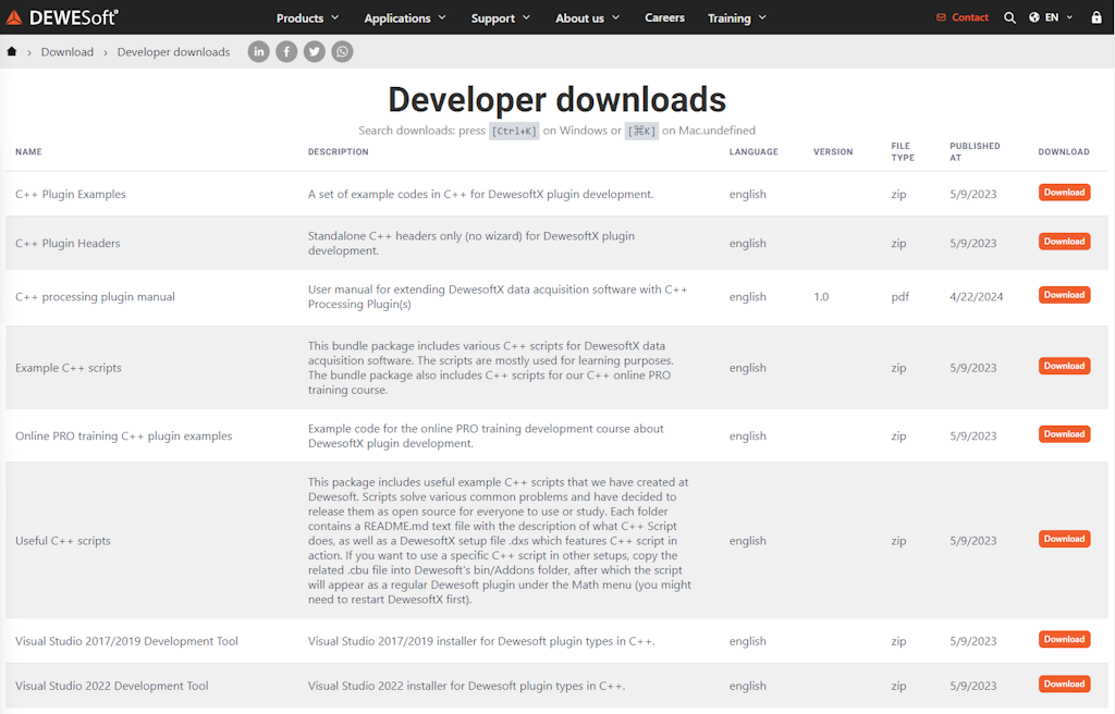
Examples of C++ Widget plugins referenced in this tutorial are available on Dewesoft's website under: Support > Dewesoft Downloads > Developer downloads > Online PRO training C++ plugin examples.
How to install the Dewesoft plugin template?
To start using the C++ Widget Plugin, you must have the Visual Studio IDE installed on your system. We chose Visual Studio because of its powerful features and developer tools—such as IntelliSense code completion, debugging support, a fast code editor, and flexible customization capabilities.
You can download the DewesoftX Widget Plugin template from the Dewesoft website by navigating to: Support > Dewesoft Downloads > Developer Downloads > Visual Studio Development Tool (2017/2019 or 2022). After downloading, simply double-click the file and the VSIX installer will guide you through the installation process.

Once Visual Studio is installed, you can create a new Dewesoft plugin project by opening the New Project window and selecting the DewesoftX C++ Widget Plugin template.
To open the New Project window, go to:
File > New > Project


Example I: digital meter
To gain a better understanding of how to work with the C++ Widget Plugin, we will implement a very simple widget similar to the Digital Meter that already exists in Dewesoft. The Digital Meter displays the value of a channel at the current timestamp, allows only one input channel at a time, and shows the channel name in the top-left corner.
The Digital Meter we will mimic looks like this:


Our widget will also support only one channel at a time, but it will display only the value of the channel—not the channel name.
New C++ widget plugin
Now, let’s return to Visual Studio. To create a new C++ Widget Plugin, click the Project button under File > New > Project. Select the DewesoftX Widget Plugin template and enter the name of your project. After clicking the OK button, a wizard window will appear to guide you through the creation of the plugin.


Since your plugin will be integrated into Dewesoft, it needs to know Dewesoft’s installation location. You can specify a custom path (by providing the absolute path), or you can use the system variables: DEWESOFT_EXE_X86 for the 32-bit version of Dewesoft, or DEWESOFT_EXE_X64 for the 64-bit version. To set these variables, open the System Properties window (press the Windows key and search for “Edit the system environment variables”), go to the Advanced tab, and click on Environment Variables.
After clicking the Next button, the following window will appear, where you can set the plugin information—such as the plugin name, owner, and version.

Plugin name - The name that will be seen in Dewesoft.
Description - Short description of your plugin.
Vendor - Company that created the plugin.
Copyright - Owner of the plugin.
Major version - Sets the initial major version. The value should change when a breaking change occurs (it's incompatible with previous versions).
Minor version - Sets the initial minor version. The value should change when new features and bug fixes are added without breaking compatibility.
Release version - Sets the initial release version. The value should change if the new changes contain only bugfixes.
All fields are optional except for the Plugin name, which is required.
Click Next again, and a final window will appear where you can set your Base class name. This name will be used as a prefix for the class and project name. Once you've set it, click Finish, and the wizard will generate the plugin template based on your selections.

Structure of the solution
When the new C++ Widget Plugin project is created, the wizard will automatically generate the necessary files and project structure for development. In the image below, you can see the project tree structure with collapsed items. In our case, ProTutorial refers to the text entered as the Base class name.


ProTutorialPlugin - The actual plugin implementation
ProTutorialPluginTest - Solution for writing unit tests for ProTutorialPlugin.
gtest - Simple library, required by ProTutorialPluginTest for unit testing your plugin. This project should not be modified.
As mentioned earlier, our plugin implementation resides in the ProTutorialPlugin project. This project includes files for writing the main plugin code, as well as the Dewesoft_internal folder, which contains methods for interacting with Dewesoft. The main logic of the plugin is written in the plugin.h and plugin.cpp files. In these files, we connect input channels, define the behavior of our custom widget, and configure additional properties and setup variables.
Once the project is successfully generated, we are ready to extend Dewesoft. But before implementing the plugin logic, let’s examine how the plugin integrates into Dewesoft by default. To do this, start the program by pressing F5 or clicking the Start button in the center of Visual Studio’s main toolbar.


After Dewesoft loads, your widget will be accessible in Measure mode under Measure > More > TestWidgetExample.


As you’ll see, it already includes an example widget...


Example I: removing sample code
As mentioned earlier, when we create a new C++ Widget Plugin, it already contains an example widget. Before we write our own widget, we’ll remove the code from this example. We will also delete all the methods that are not needed for our custom plugin.
It’s important to remember that C++ uses header files (recognized by the .h extension) iextension) in addition to source files (with the .cpp extension). Header files declare variables and methods, while their definitions (or implementations) are written in the source files.
To ensure that our plugin still compiles and functions correctly, we need to remove the example code from both the .h file and .cpp files.
The plugin.h file should now look like this:
1#pragma once
2#include "interface/plugin_base.h"
3#include "dcomlib/dcom_utils/colors.h"
4
5struct VisualProperties
6{
7};
8
9class ProTutorialWidget : public Dewesoft::Widgets::Api::Widget
10{
11public:
12    ProTutorialWidget();
13    ~ProTutorialWidget() override;
14
15    static void getPluginProperties(PluginProperties& props);
16
17    void drawCanvasData(DrawDataParams& drawParams) override;
18    void acceptInputSlots() override;
19
20    void updateSetup(Setup& setup) override;
21
22    void initVisualProperties(VCProperties& visualProperties) override;
23    void updateVisualProperties(VCProperties& visualProperties) override;
24    void visualPropertyChanged(std::string& groupId, VCProperty& visualProperty) override;
25    void visualPropertyButtonClick(std::string& groupId, VCProperty& visualProperty, int buttonIndex) override;
26private:
27    VCPropertiesGroup group;
28};
and the plugin.cpp file should now look like this:
1#include "StdAfx.h"
2#include "plugin.h"
3#include <cstdlib>
4#include <algorithm>
5#include <assert.h>
6
7namespace dcom = Dewesoft::Utils::Dcom::Utils;
8
9ProTutorialWidget::ProTutorialWidget()
10{
11}
12
13ProTutorialWidget::~ProTutorialWidget()
14{
15}
16
17void ProTutorialWidget::getPluginProperties(PluginProperties& props)
18{
19    props.name = "Pro tutorial";
20    props.description = "Pro tutorial example example";
21    props.maxAllowedInputChannels = 4;
22    props.width = 400;
23    props.height = 300;
24    props.extendOnAdd = true;
25    props.hasUnifiedProperties = true;
26    props.supportsFreezeMode = true;
27}
28
29void ProTutorialWidget::drawCanvasData(DrawDataParams& drawParams)
30{
31}
32
33void ProTutorialWidget::acceptInputSlots()
34{
35    InputSlots inputSlots = getInputSlots();
36    InputSlot slot = inputSlots.addSlot();
37    slot.setOnAcceptChannel([](IInputSlotPtr slot, IInputChPtr inputCh) {
38        return true;
39    });
40
41    slot.setOnAcceptGroup([](IInputSlotPtr slot, IInputGroupPtr inputGroup) {
42        return true;
43    });
44}
45
46void ProTutorialWidget::updateSetup(Setup& setup)
47{
48}
49
50void ProTutorialWidget::initVisualProperties(VCProperties& visualProperties)
51{
52}
53
54void ProTutorialWidget::updateVisualProperties(VCProperties& visualProperties)
55{
56}
57
58void ProTutorialWidget::visualPropertyChanged(std::string& groupId, VCProperty& visualProperty)
59{
60}
61
62void ProTutorialWidget::visualPropertyButtonClick(std::string& groupId, VCProperty& visualProperty, int buttonIndex)
63{
64}
Now, when we run the plugin and add the widget to the display, you should see a blank black window—ready for us to start building our custom functionality.
Example I: code
To ensure our plugin works correctly, it needs to communicate with Dewesoft. The plugin communicates with Dewesoft through files and functions found in the Dewesoft_internals ffolder, but we will access this code through functions and variables defined in the plugin.h and plugin.cpp files of the project. These files contain functions and events that are triggered at specific times (e.g., when measurement starts, when it stops, or when the setup is saved).
In the rest of this section, we describe the methods that were modified to ensure our plugin functions as expected.
getPluginProperties
The intitializePlugin() method is called when your plugin is loaded into Dewesoft, which happens each time Dewesoft starts. The properties set in this method are initialized only once and cannot be changed later. Here, we can set properties such as the name and description of the widget, its default width and height when first added to the display, and the number of channels it can display simultaneously. The SupportsFreezeMode property enables the widget to also display data in freeze mode.
1void ProTutorialWidget::getPluginProperties(PluginProperties& props)
2{
3    props.name = "Pro tutorial";
4    props.description = "Widget example for Pro tutorial";
5    props.maxAllowedInputChannels = 4;
6    props.width = 400;
7    props.height = 300;
8    props.supportsFreezeMode = true;
9    props.extendOnAdd = true;
10    props.hasUnifiedProperties = true
11}
The last two properties relate to widget behavior when extended to include multiple controls. These properties correspond to the drawing region settings in the upper left panel visible when the widget is selected. You can add or remove widgets using the Controls buttons (see image below). If the .extendOnAdd property is set to true, a newly added widget maintains the same size as the first. If set to false, all widgets are scaled to fit the original window size.
These multiple widgets can share unified properties. For example, if a user sets the display color for one widget, all others will inherit the same color. Similarly, changing the graph type from line to histogram affects all widgets. If this behavior is undesirable, set the .hasUnifiedProperties property to false. If it's true, the user can manually disable it by unchecking the Unified properties checkbox (see image below).


Widget
The very first procedure that gets called when a new widget is created. We will set the channel precision and font size to the default values and also check if the default values are correct
1ProTutorialWidget::ProTutorialWidget()
2{
3    userChannelPrecision = kDefaultChannelPrecision;
4    userFontSize = kDefaultFontSize;
5
6    assert(userChannelPrecision >= 0 && "Precision can not be smaller than 0.");
7    assert(userFontSize > 0  && "Font size must be greater than 0.");
8}
In order for the above code to work, we also need to define the variables we used in the header file of the plugin. To do that we will add the following code to the private section ProTutorialWidget class inside the plugin.h file.
1int kDefaultChannelPrecision = 3;
2int kDefaultFontSize = 36;
3
4int userChannelPrecision;
5int userFontSize;
acceptInputSlots
Our widget may not be compatible with all channel types. To prevent users from adding unsupported channels (which may cause errors), we limit the accepted channels. In our case, only scalar channels are allowed—vector or matrix channels and channel groups are not supported.
This is controlled via the acceptInputSlots() method. An input slot represents an individual channel or channel group. Each time a slot is assigned, a new one must be added using the addSlot() method. We use lambda functions with setOnAcceptChannel() and setOnAcceptGroup(). to define which channels or groups are accepted. These functions are called for each available channel/group, and if the return value is true, the item appears in the widget’s channel selection panel.
1void ProTutorialWidget::acceptInputSlots()
2{
3    InputSlots inputSlots = getInputSlots();
4    InputSlot slot = inputSlots.addSlot();
5
6    slot.setOnAcceptChannel([](IInputSlotPtr slot, IInputChPtr inputCh) {
7        return !inputCh->Ch->ArrayChannel;
8    });
9
10    slot.setOnAcceptGroup([](IInputSlotPtr slot, IInputGroupPtr inputGroup) {
11        return false;
12    });
13}

drawCanvasData
Now, we're ready to visualize data from selected channels. This is handled in the drawCanvasData() method, which is typically called at a rate of 50 Hz (this depends on Dewesoft settings and system performance). The input parameter is a structure called DrawDataParams which includes canvas, rect, and colorPalette.
Before we continue with our example let us take a closer look at these parameters and how to use them.
The colorPalette parameter holds the information about common colors that all widgets use and are defined by the selected Dewesoft theme. The following colors are specified:
backColor - the background color of the control
highlightBackColor - the background color of controls that have some sort of user interaction or must be emphasized
fontColor - the color of the font
ticksColor - the color of axis ticks (if drawing graphs)
subticksColor - the color of axis subticks (if drawing graphs)
The rect parameter holds the information of the location and size of the drawing region (rectangle) of the widget. The location of the rectangle is relative to the display, meaning that the upper left corner of the widget will always have coordinates (0, 0) no matter where on the display it is located. We will use the rect parameter to calculate the middle of the drawing region to determine where to display the text.
1int x = int(round(rect.x + (rect.width - rect.x) / 2 - (canvas.getTextWidth(text) / 2)));
2int y = int(round(rect.y + (rect.height - rect.y) / 2 - (canvas.getTextHeight(text) / 2)));
The canvas parameter holds the functions and properties used for drawing. The Font is used for setting the text, the Brush is used for setting the text and drawn objects (rectangle, circle, etc.) background the Pen is used for setting the borders of drawn objects (lines, rectangles, etc.) We can set the following properties:
Font:
Color - the color of the font set as a long dcom::Color
Style - the style of the font (bold, italic, underline, strikeout) set as a custom enum, you can combine them by creating a vector of styles like {cbsBold, cbsUnderline}
Size - the size of the font set in pixels as an integer
Name - the name of the font family (arial, tahoma, sanserif, etc.) set as a string
Brush:
Color - the color of the brush set as a long dcom::Color
Style - the pattern for the brush (clear, solid, diagonal, vertical, etc.) set as a custom enum
Pen:
Color - the color of the pen set as a long dcom::Color
Style - the style in which the pen draws lines (solid, dot, dash, clear, etc.) set as a custom enum
Width - the width of the pen in pixels set as an integer
Mode - determine how the color of the pen interacts with the color on the canvas (always black, the inverse of canvas background color, unchanged, etc.)
Majority of the properties are of type integer and to make the code more descriptive we use predefined custom enums to set them. All enums follow the same naming principle, the prefix of the enum is the first letters of the property you want to set (the prefix of the enum for setting canvas.getPen().setMode to cpm) followed by the general name of the setting. For example, if we want to set the font style to bold we would write canvas.getFont().setStyle({cfsBold}) or if we want to set the pen style to dashed we would write canvas.getPen().setStyle({cpsDash}).
The properties of the font, brush, and pen have to be set before we start drawing to the canvas as our drawing functions will use them to draw the objects. To draw on the canvas we use the predefined functions. If we want to just write a text to our widget we use the textOut() or textRect(). The difference between these two functions is that the textRect() function outputs the text inside a rectangle if the text is too long for the rectangle it gets clipped to fit inside it. We can also draw a rectangle: use the rectangle() function, an ellipse: use the ellipse() function, and a line: use the moveTo() and lineTo() functions. The input parameters to all of these functions is the location of the object.
We retrieve selected input channels with getInputChannels() and read their current values using getCurrentValue() .
In our case, the widget will display the current value of the input channel using textOut() . We'll also match the text color to the channel color and use a clear brush style.. The full code for drawCanvasData() should implement this functionality.
1void ProTutorialWidget::drawCanvasData(DrawDataParams& drawParams)
2{
3    if (getInputChannels().getCount() < 1)
4        return;
5
6    Canvas& canvas = drawParams.canvas;
7    Rect& controlRect = drawParams.rect;
8    Channel& channel = getInputChannels()[0];
9
10    double currentValue = channel.getCurrentValue();
11    std::wstring text = (std::wstringstream() << std::setprecision(userChannelPrecision) << std::fixed << currentValue).str();
12
13    canvas.getFont().setSize(userFontSize);
14
15    int x = int(round(controlRect.x + (controlRect.width - controlRect.x) / 2 - (canvas.getTextWidth(text) / 2)));
16    int y = int(round(controlRect.y + (controlRect.height - controlRect.y) / 2 - (canvas.getTextHeight(text) / 2)));
17
18    canvas.getFont().setColor(channel.getMainDisplayColor());
19    canvas.getBrush().setStyle(cbsClear);
20    canvas.textOut(x, y, text);
21}
updateSetup
Although the user can't change the text precision or font size yet (we’ll handle that in the next section), we still want the plugin to remember these values when saving or loading the setup. This is achieved using the update() function for setup variables.
The first parameter of the function is the name of XML element under which your setting is saved. This parameter should be unique for every setting.
The second parameter is the actual value to be stored.
The optional third parameter specifies what the default value should be.
Settings are updated in the updateSetup() method within the plugin.cpp file, as shown in the code below.
1void ProTutorialWidget::updateSetup(Setup& setup)
2{
3    setup.update("fontSize", userFontSize);
4    setup.update("channelPrecision", userChannelPrecision);
5}
Example I: visual properties
If we now run the plugin by pressing F5 and go to the Measure tab, we can add our widget to the display. In the image below, you can see how the widget appears. The channel displayed on the widget is the time signal, which you can create in Channel Setup → Math → Formula, and then by selecting the time signal under the Signals tab.


But what if the user wants a larger font for the text or wishes to display more digits? We can add options that allow the user to change these settings. This is done by defining visual properties, which appear in the left panel when the widget is selected. We'll add a drop-down menu to let users change the font size, a text box to adjust channel precision, and a reset button to restore default values.
We define these visual properties as a struct of type VisualProperties in the plugin.h file
1struct VisualProperties
2{
3    static constexpr char FontSizeSelect[] = "FontSizeSelect";
4    static constexpr char ResetButton[] = "ResetButton";
5    static constexpr char PrecisionEdit[] = "PrecisionEdit";
6};
Dewesoft accesses and uses these properties via their string-based identifiers behind the scenes.
initVisualProperties
We initialize the desired visual properties in the initVisualProperties method. These properties are added to a group, which we can name freely. You can create multiple groups to visually organize the settings for better usability.
All visual properties are added using add...Property(const std::string& propertyId, const std::wstring& name) functions. The first argument is the property’s internal ID, and the second is the label shown to the user.
To add the drop-down menu, we use the addSelectProperty() function. Font size options are added using the add() method, with each size passed as a string.
For the precision input, we use addFloatProperty() , which creates a text box that only accepts numerical input. We also set the minimum and maximum allowed values using the minValue and maxValue properties of the FloatProperty. If the user enters an invalid precision value, the plugin ignores the change.
The reset button is added using addLabelProperty() . Then, we attach an actual button to this property using addButton(). tThe first parameter is a tooltip/hint, and the second is the name of the icon. Note: addButton() is only available for label properties.
1void ProTutorialWidget::initVisualProperties(VCProperties& visualProperties)
2{
3    group = visualProperties.addOrFindGroup("Advanced");
4    group.setName(L"Drawing Options");
5
6    SelectVCProperty fontSizeDropDown(group.addSelectProperty(VisualProperties::FontSizeSelect, L"Font size"));
7    fontSizeDropDown.add(L"36");
8    fontSizeDropDown.add(L"40");
9    fontSizeDropDown.add(L"44");
10    fontSizeDropDown.add(L"48");
11
12    FloatVCProperty precisionEdit(group.addFloatProperty(VisualProperties::PrecisionEdit, L"Number of decimals"));
13    precisionEdit.setMinValue(0);
14    precisionEdit.setMaxValue(15);
15
16    LabelVCProperty resetButton(group.addLabelProperty(VisualProperties::ResetButton, L"Reset to default"));
17    resetButton.addButton(L"Reset properties to default", "REFRESH");
18}
updateVisualProperties
The updateVisualProperties() procedure gets called immediately after initVisualProperties() , and again each time a visual property changes. Here, we assign the current values to the visual controls. For instance, we set the selected item of the font size drop-down to the value stored in the userFontSize variable and we will display the userChannelPrecision value in the precision text box.
1void ProTutorialWidget::updateVisualProperties(VCProperties& visualProperties)
2{
3    group = visualProperties.findGroup("Advanced");
4
5    SelectVCProperty fontSizeDropDown(group.findProperty(VisualProperties::FontSizeSelect));
6    if (fontSizeDropDown.isAssigned())
7    {
8        std::wstring fontSizeText = std::to_wstring(userFontSize);
9        fontSizeDropDown.setItemIndex(0);
10        for (int i = 0; i < fontSizeDropDown.getCount(); i++)
11        {
12            if (fontSizeDropDown.getItem(i) == fontSizeText)
13            {
14                fontSizeDropDown.setItemIndex(i);
15                userFontSize = std::stoi(fontSizeDropDown.getItem(i));
16            }
17        }
18    }
19
20    FloatVCProperty precisionEdit(group.findProperty(VisualProperties::PrecisionEdit));
21    if (precisionEdit.isAssigned())
22        precisionEdit.setValue(userChannelPrecision);
23}
visualPropertyChanged
The procedure which gets called every time a property changes, for example when the user chooses a different font size in the drop-down menu or when they input a new valid precision. We check which property has changed and assign the changed property value to the corresponding variable.
1void ProTutorialWidget::visualPropertyChanged(std::string& groupId, VCProperty& visualProperty)
2{
3    std::string propID = visualProperty.getId();
4
5    if (propID == VisualProperties::PrecisionEdit)
6    {
7        FloatVCProperty precisionText(visualProperty);
8        userChannelPrecision = precisionText.getValue();
9    }
10    else if (propID == VisualProperties::FontSizeSelect)
11    {
12        SelectVCProperty select(visualProperty);
13        userFontSize = std::stoi(select.getItem(select.getItemIndex()));
14    }
15}
visualPropertyButtonClick
Lastly, the visualPropertyButtonClick() method is called whenever a button in the visual properties panel is clicked. In our case, this resets both the font size and the precision values back to their defaults when the user clicks the Reset button.
1void ProTutorialWidget::visualPropertyButtonClick(std::string& groupId, VCProperty& visualProperty, int buttonIndex)
2{
3    FloatVCProperty precisionText(group.findProperty(VisualProperties::PrecisionEdit));
4    if (precisionText.isAssigned())
5    {
6        precisionText.setValue(kDefaultChannelPrecision);
7        userChannelPrecision = kDefaultChannelPrecision;
8    }
9    SelectVCProperty fontSizeDropDown(group.findProperty(VisualProperties::FontSizeSelect));
10    if (fontSizeDropDown.isAssigned())
11    {
12        fontSizeDropDown.setItemIndex(0);
13        userFontSize = kDefaultFontSize;
14    }
15}
Example I: result
After completing all the previous steps, our custom widget will appear as follows:


The input channels accepted by our widget are scalar channels, and the user can modify the font size and precision. Additionally, a single click on the reset button will restore all changes to their default values.
Example II
In the previous sections of this tutorial, we created a very simple digital meter that accepts scalar channels and displays the current value of the selected channel. Now, let's move on to a more complex example.
We will implement a horizontal bar graph, where the value of each channel is displayed both numerically—at the beginning of the bar—and visually—through the bar’s fill level. This widget will support multiple channels of scalar, vector, or matrix types. Users will be able to: Set the font size for the channel name text. Define the minimum and maximum values for each channel. Choose whether to apply the custom minimum and maximum values or not. Reset all settings to their default values with a single reset button.
By the end, our widget will look like this:


Example II: code
To create this widget, we can either start a completely new plugin or modify the one we already have. In either case, we should once again remove all the code from our plugin so that the plugin.h and plugin.cpp files look clean and ready for the new implementation.
getPluginProperties
In this example, we will configure the plugin properties to allow multiple input channels to be displayed simultaneously. We’ll set the maximum number of input channels to 4, and we’ll also make the default widget window size larger than in the previous case.
1void ProTutorialWidget::getPluginProperties(PluginProperties& props)
2{
3    props.name = "Pro tutorial";
4    props.description = "Widget example for Pro tutorial";
5    props.maxAllowedInputChannels = 4;
6    props.width = 400;
7    props.height = 300;
8    props.extendOnAdd = true;
9    props.hasUnifiedProperties = true;
10    props.supportsFreezeMode = true;
11}
As mentioned, we will allow the user to specify the minimum and maximum values for each channel. Therefore, we need to declare variables to hold these values in the private section of the ProTutorialWidget class within the plugin.h file. At this point, we will also add variables to store the font size and a flag indicating whether the user wants to apply channel limits.
1int userFontSize = 12;
2bool useManualLimits = false;
3double minChannelValue = -10.0;
4double maxChannelValue = 10.0;
Widget
In the constructor of the class, we will check whether the defined minimum and maximum channel values are valid.
1ProTutorialWidget::ProTutorialWidget()
2{
3    assert(minChannelValue <= maxChannelValue && "Minimum channel value cannot be greater than maximum channel value.");
4}
acceptInputSlots
Since we want this widget to support all channel types, we will simply allow all channels available in the current setup to be assigned as input channels.
1void ProTutorialWidget::acceptInputSlots()
2{
3    InputSlots inputSlots = getInputSlots();
4    InputSlot slot = inputSlots.addSlot();
5
6    slot.setOnAcceptChannel([](IInputSlotPtr slot, IInputChPtr inputCh) {
7        return true;
8    });
9
10    slot.setOnAcceptGroup([](IInputSlotPtr slot, IInputGroupPtr inputGroup) {
11        return false;
12    });
13}
updateSetup
When a setup containing our widget is loaded, we also want to load the saved values for font size, channel limits, and whether those limits should be applied. To achieve this, we will update the corresponding variables in the updateSetup() method.
1void ProTutorialWidget::updateSetup(Setup& setup)
2{
3    setup.update("fontSize", userFontSize);
4    setup.update("minChannelValue", minChannelValue);
5    setup.update("maxChannelValue", maxChannelValue);
6    setup.update("useManualLimits", useManualLimits);
7}
The drawCanvasData() function will be a bit more complex than in the previous example. To keep things clear and maintainable, we will divide the code into several smaller helper functions, each responsible for a specific task. The main drawCanvasData() function and its helper functions will be written and explained in the next section.
Example II: drawCanvasData
In the code for drawing the widget, we will use many constant values for variables such as horizontal and vertical spacing between objects, the height of the bar, and so on. We will define these values as constants in the private section of the ProTutorialWidget class within the plugin.h file. To distinguish these from other variables, we will prefix them with "k". The names of the constants should be descriptive enough for other developers to easily understand their purpose.
1const int kBarHeight = 18;
2
3const int kYSpacing = 30;
4const int kXSpacing = 30;
5
6const int kTitleFontSize = 10;
7const int kValueFontSize = 8;
8
9const double kValidatorMaxLimit = 1000;
10const double kValidatorMinLimit = -1000;
The main drawCanvasData() function for our example will look like this:
1void ProTutorialWidget::drawCanvasData(DrawDataParams& drawParams)
2{
3    Canvas& canvas = drawParams.canvas;
4    Rect& controlRect = drawParams.rect;
5
6    int yScreenCoordinate = kYSpacing;
7    Rect titleRect(0, 0, controlRect.width, yScreenCoordinate);
8
9    drawGraphTitle(drawParams, titleRect, L"Widget example");
10    yScreenCoordinate += kYSpacing;
11
12    size_t maxChannelsOnVisibleArea = (size_t)round(controlRect.height / kYSpacing);
13
14    int channelIndex = 0;
15    ChannelList inputChannels = getInputChannels();
16    while ((channelIndex < inputChannels.getCount()) && (maxChannelsOnVisibleArea > 0))
17    {
18        Channel channel = inputChannels[channelIndex];
19
20        drawChannelName(channel, drawParams, kXSpacing, yScreenCoordinate);
21        yScreenCoordinate += canvas.getTextHeight(channel.getName());
22
23        drawChannelValue(channel, drawParams, controlRect.width, yScreenCoordinate, maxChannelsOnVisibleArea);
24        yScreenCoordinate += channel.getArraySize() * kYSpacing;
25        channelIndex++;
26    }
27}
As we can see, we will create two local variables—one to keep track of the index of the last displayed channel, and another to track how much horizontal space on the widget has already been used. We will also create a title rectangle to display the global title of the widget, and we’ll render it using the custom drawGraphTitle() function. In addition, we’ll implement a function to draw the current channel’s name, value, and unit. All of these drawing functions are defined in the private section of the ProTutorialWidget class in the plugin.h file. Several additional helper functions will also be required; their definitions are provided in the code below.
1class ProTutorialWidget : public Dewesoft::Widgets::Api::Widget
2{
3public:
4    // ...
5
6private:
7    // ...
8
9    double getChannelMinValue(Channel& ch);
10    double getChannelMaxValue(Channel& ch);
11
12    int getCenterTextCoordinate(DrawDataParams& drawParams, Rect& rect, const std::wstring& text);
13    int getBarWidth(double currentValue, double minValue, double maxValue, Rect& barRect);
14
15    void drawBar(Channel& channel, size_t arrayIndex, DrawDataParams& drawParams, Rect& barRect);
16    void drawGraphTitle(DrawDataParams& drawParams, Rect& titleRect, const std::wstring& text);
17    void drawChannelName(Channel& channel, DrawDataParams& drawParams, int x, int y);
18    void drawChannelValue(Channel& channel, DrawDataParams& drawParams, int controlRectWidth, int y, size_t& maxChannelsOnVisibleArea);
19
20    std::wstring buildBarText(Channel& channel, size_t arrayIndex, double currentValue);
21    void drawUnit(Channel& channel, DrawDataParams& drawParams, Rect& barRect);
22
23 std::wstring getChannelAxisValue(Channel& ch, int axisIndex, int index);1void ProTutorialWidget::drawGraphTitle(DrawDataParams& drawParams, Rect& titleRect, const std::wstring& text)
2{
3 Canvas& canvas = drawParams.canvas;
4 ColorPalette& colorPalette = drawParams.colorPalette;
5 CanvasTextFormats textFormat = { ctfCenter };
6
7 int textCenterXY = getCenterTextCoordinate(drawParams, titleRect, text);
8
9 CanvasFont& canvasFont = canvas.getFont();
10 canvasFont.setSize(kTitleFontSize);
11 canvasFont.setColor(colorPalette.fontColor);
12 canvas.getBrush().setStyle(cbsClear);
13 canvas.textRect(titleRect.x, textCenterXY, titleRect.width, titleRect.height, text, textFormat);
14}The drawGraphTitle() function accepts drawParams, a title rectangle, and the title text as parameters. It draws the text inside a textRect(). The goal is to center the title at the top of the rectangle. The center of the rectangle is calculated using the getCenterTextCoordinate() function, which is implemented as shown below.
1int ProTutorialWidget::getCenterTextCoordinate(DrawDataParams& drawParams, Rect& rect, const std::wstring& text)
2{
3    return int(round(rect.y + (rect.height - rect.y) / 2 - (drawParams.canvas.getTextHeight(text) / 2)));
4}1void ProTutorialWidget::drawChannelName(Channel& channel, DrawDataParams& drawParams, int x, int y)
2{
3 Canvas& canvas = drawParams.canvas;
4 CanvasFont& canvasFont = canvas.getFont();
5 canvasFont.setSize(userFontSize);
6 canvasFont.setColor(channel.getMainDisplayColor());
7 canvas.getBrush().setStyle(cbsClear);
8 canvas.textOut(x, y, channel.getName());
9}The drawChannelName() function is straightforward—it sets the font size and color for the text and then displays the current channel’s name. The position of this text is pre-calculated in the drawCanvasData() function.
1void ProTutorialWidget::drawChannelValue(Channel& channel, DrawDataParams& drawParams, int controlRectWidth, int y, size_t& maxChannelsOnVisibleArea)
2{
3    Rect barRect(kXSpacing, y, controlRectWidth - 4 * kYSpacing, kBarHeight);
4
5    drawUnit(channel, drawParams, barRect);
6
7    size_t arrayIndex = 0;
8    while ((arrayIndex < static_cast<size_t>(channel.getArraySize())) && (maxChannelsOnVisibleArea > 0))
9    {
10        drawBar(channel, arrayIndex, drawParams, barRect);
11        maxChannelsOnVisibleArea--;
12        arrayIndex++;
13    }
14}
Next, we need to draw the channel value inside a bar. The bar is represented as a rectangle. Inside this rectangle, we first draw the channel’s value and then fill the rectangle proportionally to reflect the value. To do this, we implement a drawBar() function responsible for rendering the bar itself. Additional helper functions include: getBarWidth() – calculates how much of the bar should be filled, buildBarText() – retrieves the correct text from the channel, getChannelAxisValue() – reads values from axes if the input channel is a vector or matrix.
The drawChannelValue() unction is called for each channel displayed on the widget. If the channel is of vector or matrix type, we render each axis value as its own bar, complete with a name and unit. We must also track how many channels have already been drawn to avoid rendering content outside the visible area of the widget.
1void ProTutorialWidget::drawUnit(Channel& channel, DrawDataParams& drawParams, Rect& barRect)
2{
3    Canvas& canvas = drawParams.canvas;
4    CanvasFont canvasFont = canvas.getFont();
5    ColorPalette& colorPalette = drawParams.colorPalette;
6
7    canvasFont.setSize(kValueFontSize);
8    canvasFont.setColor(colorPalette.fontColor);
9    canvas.getBrush().setStyle(cbsClear);
10    canvas.textOut(barRect.x + barRect.width + 10, barRect.y, channel.getUnit());
11}
The drawUnit() funcion, like drawChannelName(), simply sets the font size and color, and displays the unit at the end of the bar.
1void ProTutorialWidget::drawBar(Channel& channel, size_t arrayIndex, DrawDataParams& drawParams, Rect& barRect)
2{
3    Canvas& canvas = drawParams.canvas;
4    CanvasFont canvasFont = canvas.getFont();
5    CanvasBrush canvasBrush = canvas.getBrush();
6    CanvasPen canvasPen = canvas.getPen();
7    ColorPalette& colorPalette = drawParams.colorPalette;
8
9    double maxValue = getChannelMaxValue(channel);
10    double minValue = getChannelMinValue(channel);
11
12    double currentValue = channel.getCurrentValue(static_cast<int>(arrayIndex));
13
14    canvasBrush.setColor(colorPalette.backColor);
15    canvasPen.setColor(colorPalette.fontColor);
16    canvas.rectangle(barRect.x, barRect.y, barRect.x + barRect.width, barRect.y + barRect.height);
17
18    canvasBrush.setColor(channel.getMainDisplayColor());
19    canvasPen.setColor(colorPalette.fontColor);
20    canvas.fillRect(barRect.x + 1, barRect.y + 1, getBarWidth(currentValue, minValue, maxValue, barRect), barRect.y + barRect.height);
21
22    canvasFont.setSize(kValueFontSize);
23    canvasFont.setColor(dcom::Color::White);
24    canvasBrush.setStyle(cbsClear);
25    canvas.textOut(barRect.x + 2, barRect.y + 2, buildBarText(channel, arrayIndex, currentValue));
26
27    barRect.y += kYSpacing;
28}
The drawBar() function draws the value of the channel and fills the bar according to the ratio between the value and the defined minimum and maximum values. To draw the container of the bar, we use the rectangle() function with the specified dimensions. To fill the bar, we use fillRect() , calculating the correct width with getBarWidth() . We also provide getter functions to retrieve the minimum and maximum values—whether user-defined or default.
1double ProTutorialWidget::getChannelMinValue(Channel& ch)
2{
3    if (useManualLimits)
4        return minChannelValue;
5    else
6        return ch.getTypicalMinValue();
7}
8
9double ProTutorialWidget::getChannelMaxValue(Channel& ch)
10{
11    if (useManualLimits)
12        return maxChannelValue;
13    else
14        return ch.getTypicalMaxValue();
15}
16
17int ProTutorialWidget::getBarWidth(double currentValue, double minValue, double maxValue, Rect& barRect)
18{
19    currentValue = std::clamp(currentValue, minValue, maxValue);
20    int currentValueInPixels = (maxValue - minValue == 0.0) ? 0 : static_cast<int>(round((currentValue - minValue) / (maxValue - minValue) * barRect.width));
21    return barRect.x + currentValueInPixels - 1;
22}
23
24std::wstring ProTutorialWidget::buildBarText(Channel& channel, size_t arrayIndex, double currentValue)
25{
26    if (channel.getArrayChannel())
27        return getChannelAxisValue(channel, 0, arrayIndex) + L": " + std::to_wstring(currentValue);
28    else
29        return std::to_wstring(currentValue);
30}
Since array channels have axis values, we also implement a function to read these values. Array channels may have multiple axes, so we specify the axis index when calling getAxisDefinition() . Axis values can be of three types: string, float, or a linear function—but we don’t need to handle each type manually. The getAxisValue() function takes care of that and returns the correct value based on the axis type.
1std::wstring ProTutorialWidget::getChannelAxisValue(Channel& ch, int axisIndex, int index)
2{
3    AxisDefiniton axisDef = ch.getArrayInfo().getAxisDefinition(axisIndex);
4    return axisDef.getAxisValue(index);
5}
Our widget will now display the data as follows:


The image shows two input channels. Both are output channels from the FFT Analyzer. One is a scalar channel (FFT block count), and the other is a vector channel (AI 1/AmplFFT).
Example II: visual properties
The last thing we need to do is add the visual properties for configuring our widget. We will include a drop-down menu for selecting the font size, a checkbox to toggle whether to use manual minimum and maximum limits, two text boxes for entering those limits, and a reset button to restore all properties to their default values. In the end, the left panel should look like this:


As before, we will first define these visual properties as enums of the type VisualProperties in the plugin.h file
1struct VisualProperties
2{
3    static constexpr char MinEditText[] = "MinEditText";
4    static constexpr char MaxEditText[] = "MaxEditText";
5    static constexpr char FontSizeSelect[] = "FontSizeSelect";
6    static constexpr char ResetLabel[] = "ResetLabel";
7    static constexpr char ManualLimitsCheckbox[] = "ManualLimitsCheckbox";
8};
initVisualProperties
We will initialize the visual properties in the same way we did in the first example. The drop-down menu, reset button, and text boxes are properties we've already used. In addition, we’ll now add a checkbox using the addCheckBoxProperty() function.
1void ProTutorialWidget::initVisualProperties(VCProperties& visualProperties)
2{
3    group = visualProperties.addOrFindGroup("Advanced");
4    group.setName(L"Drawing Options");
5    SelectVCProperty fontSizeDropDown(group.addSelectProperty(VisualProperties::FontSizeSelect, L"Font size"));
6    fontSizeDropDown.add(L"12");
7    fontSizeDropDown.add(L"14");
8    fontSizeDropDown.add(L"16");
9    fontSizeDropDown.add(L"18");
10
11    group.addCheckBoxProperty(VisualProperties::ManualLimitsCheckbox, L"Use manual limits");
12    group.addFloatProperty(VisualProperties::MaxEditText, L"Max channel value");
13    group.addFloatProperty(VisualProperties::MinEditText, L"Min channel value");
14    LabelVCProperty labelButton(group.addLabelProperty(VisualProperties::ResetLabel, L"Reset to default"));
15    labelButton.addButton(L"Reset properties to default", "REFRESH");
16}
Before we look at the remaining functions that need to be implemented, we’ll add helper functions to manage the validation of minimum and maximum channel values. Specifically, we must ensure that the minimum value is always less than the maximum value. We’ll also enable or disable the text boxes depending on whether the user chooses to use manual limits.
These validator functions are defined in the private section of the ProTutorialWidget class in the plugin.h file.
1class ProTutorialWidget : public Dewesoft::Widgets::Api::Widget { public:
2    // ...
3 private:
4    // ...
5    void updateMinEditValidator();
6    void updateMaxEditValidator();
7}
TTheir implementation in the plugin.cpp file looks like this:
1void ProTutorialWidget::updateMinEditValidator()
2{
3    FloatVCProperty minEditText(group.findProperty(VisualProperties::MinEditText));
4    if (minEditText.isAssigned())
5    {
6        minEditText.setMinValue(kValidatorMinLimit);
7        minEditText.setMaxValue(maxChannelValue);
8        minEditText.setEnabled(useManualLimits);
9    }
10}
11
12void ProTutorialWidget::updateMaxEditValidator()
13{
14    FloatVCProperty maxEditText(group.findProperty(VisualProperties::MaxEditText));
15    if (maxEditText.isAssigned())
16    {
17        maxEditText.setMinValue(minChannelValue);
18        maxEditText.setMaxValue(kValidatorMaxLimit);
19        maxEditText.setEnabled(useManualLimits);
20    }
21}
updateVisualProperties
We update all visual properties based on the values of their corresponding variables.
1void ProTutorialWidget::updateVisualProperties(VCProperties& visualProperties)
2{
3    group = visualProperties.findGroup("Advanced");
4
5    CheckBoxVCProperty manualLimitsCheckbox(group.findProperty(VisualProperties::ManualLimitsCheckbox));
6    if (manualLimitsCheckbox.isAssigned())
7        manualLimitsCheckbox.setChecked(useManualLimits);
8
9    FloatVCProperty minEditText(group.findProperty(VisualProperties::MinEditText));
10    if (minEditText.isAssigned())
11    {
12        minEditText.setValue(minChannelValue);
13        updateMaxEditValidator();
14    }
15
16    FloatVCProperty maxEditText(group.findProperty(VisualProperties::MaxEditText));
17    if (maxEditText.isAssigned())
18    {
19        maxEditText.setValue(maxChannelValue);
20        updateMinEditValidator();
21    }
22
23    SelectVCProperty fontSizeDropDown(group.findProperty(VisualProperties::FontSizeSelect));
24    if (fontSizeDropDown.isAssigned())
25    {
26        std::wstring fontSizeText = std::to_wstring(userFontSize);
27        fontSizeDropDown.setItemIndex(0);
28        for (int i = 0; i < fontSizeDropDown.getCount(); i++)
29        {
30            if (fontSizeDropDown.getItem(i) == fontSizeText)
31            {
32                fontSizeDropDown.setItemIndex(i);
33               userFontSize = std::stoi(fontSizeDropDown.getItem(i));
34            }
35        }
36    }
37}
visualPropertyChanged
When one of the visual properties is changed, we store the new value in the appropriate variable.
1void ProTutorialWidget::visualPropertyChanged(std::string& groupId, VCProperty& visualProperty)
2{
3    std::string propID = visualProperty.getId();
4
5    if (propID == VisualProperties::ManualLimitsCheckbox)
6    {
7        CheckBoxVCProperty manualLimitsCheckbox(visualProperty);
8        useManualLimits = manualLimitsCheckbox.getChecked();
9    }
10    else if (propID == VisualProperties::MinEditText)
11    {
12        FloatVCProperty minText(visualProperty);
13        minChannelValue = minText.getValue();
14    }
15    else if (propID == VisualProperties::MaxEditText)
16    {
17        FloatVCProperty maxText(visualProperty);
18        maxChannelValue = maxText.getValue();
19    }
20    else if (propID == VisualProperties::FontSizeSelect)
21    {
22        SelectVCProperty select(visualProperty);
23        userFontSize = std::stoi(select.getItem(select.getItemIndex()));
24    }
25}
visualPropertyButtonClick
When the user clicks the reset button, we call the resetPropertiesToDefault() function to restore all visual properties to their default values.
1void ProTutorialWidget::visualPropertyButtonClick(std::string& groupId, VCProperty& visualProperty, int buttonIndex)
2{
3    if (visualProperty.getId() == VisualProperties::ResetLabel)
4        resetPropertiesToDefault();
5}
This function should first be declared in the private section of the ProTutorialWidget class in the plugin.h file.
1class ProTutorialWidget: public Dewesoft::Widgets::Api::Widget
2{
3public:
4    // ...
5
6private
7    // ...
8    void resetPropertiesToDefault();
9}
Its implementation in the plugin.cpp file looks like this:
1void ProTutorialWidget::resetPropertiesToDefault()
2{
3    FloatVCProperty minEditText(group.findProperty(VisualProperties::MinEditText));
4    if (minEditText.isAssigned())
5    {
6        minEditText.setValue(0);
7        minChannelValue = 0.0;
8    }
9
10    FloatVCProperty maxEditText(group.findProperty(VisualProperties::MaxEditText));
11    if (maxEditText.isAssigned())
12    {
13        maxEditText.setValue(0);
14        maxChannelValue = 0.0;
15    }
16
17    SelectVCProperty fontSizeDropDown(group.findProperty(VisualProperties::FontSizeSelect));
18    if (fontSizeDropDown.isAssigned())
19    {
20        fontSizeDropDown.setItemIndex(0);
21        userFontSize = 12;
22    }
23}
Example II: result
After completing all the steps in the previous sections, we should have a widget that looks like this. It accepts input channels of any type—scalar, vector, or matrix—and displays the current value of the channel or axis, along with the channel name and unit. It also displays the title of the graph. The user can change the font size and set manual minimum and maximum limits for the channel. Additionally, a reset button has been added to restore the changed values to their default settings.


The channels shown in the image above are the time signal and the output channels from the FFT Analysis, with the acquisition sample rate set to 100 and the FFT resolution set to 5 lines.
Import/export
In this Pro Training, we have created two new widgets. You might want to use them in other setups or on different computers. The C++ Widget Plugin compiles your plugin into an external library, which can be integrated into any Dewesoft installation around the world.
Your C++ Widget Plugin is compiled into a file with a .vc extension. This file contains the instructions that Dewesoft uses to perform specific functions based on your plugin’s purpose. To export it, you first need to locate the file. It can be found in the DEWESoftX\DEWEsoft\Bin\Addons folder, inside a subfolder named after your plugin’s base class name.


To import your plugin into another Dewesoft installation, simply copy the .vc file and paste it into the Addons folder of the target system. Dewesoft will then automatically recognize and load the plugin.
Page 1 of 15